


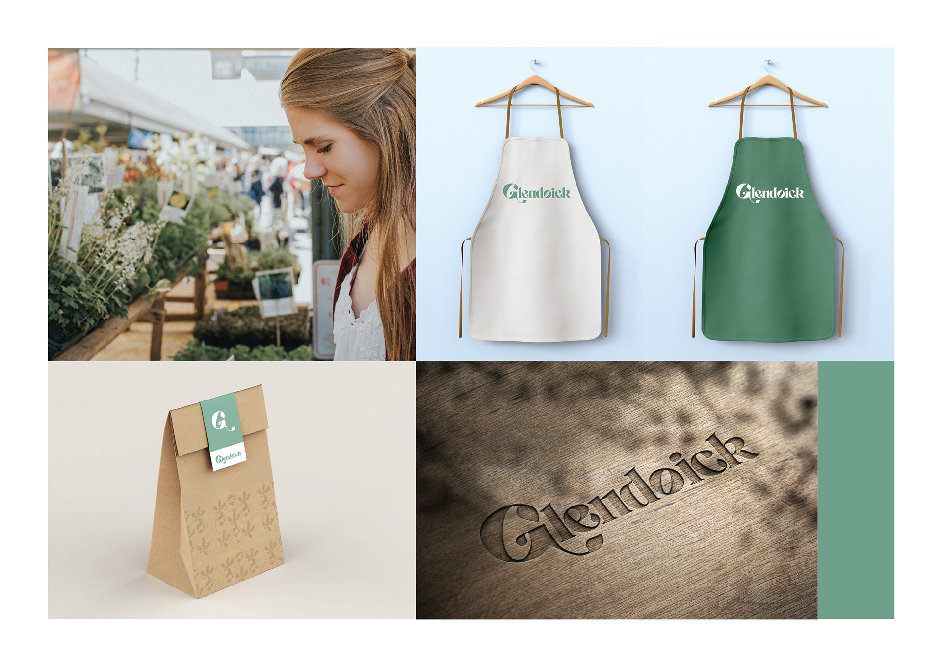
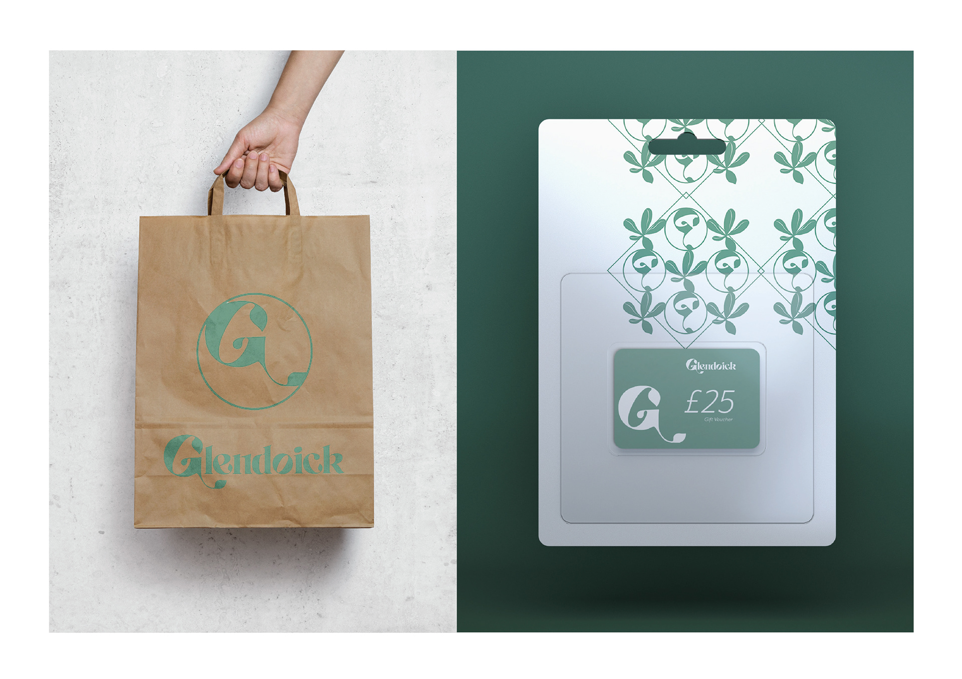
This was a personal project where I chose a local garden centre that's branding I felt needed a refresh. I chose a garden centre a few miles away from home called Glendoick. I felt their logo lacked the freshness and natural flow a garden centre should evoke.
I chose soft greens and a light purple colour to connect with the old branding and I was influenced by the traditional Scottish thistle.
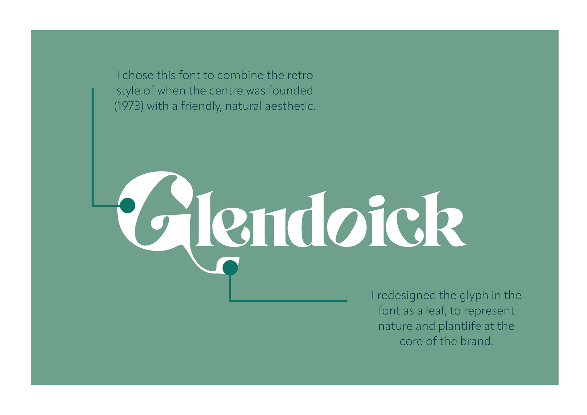
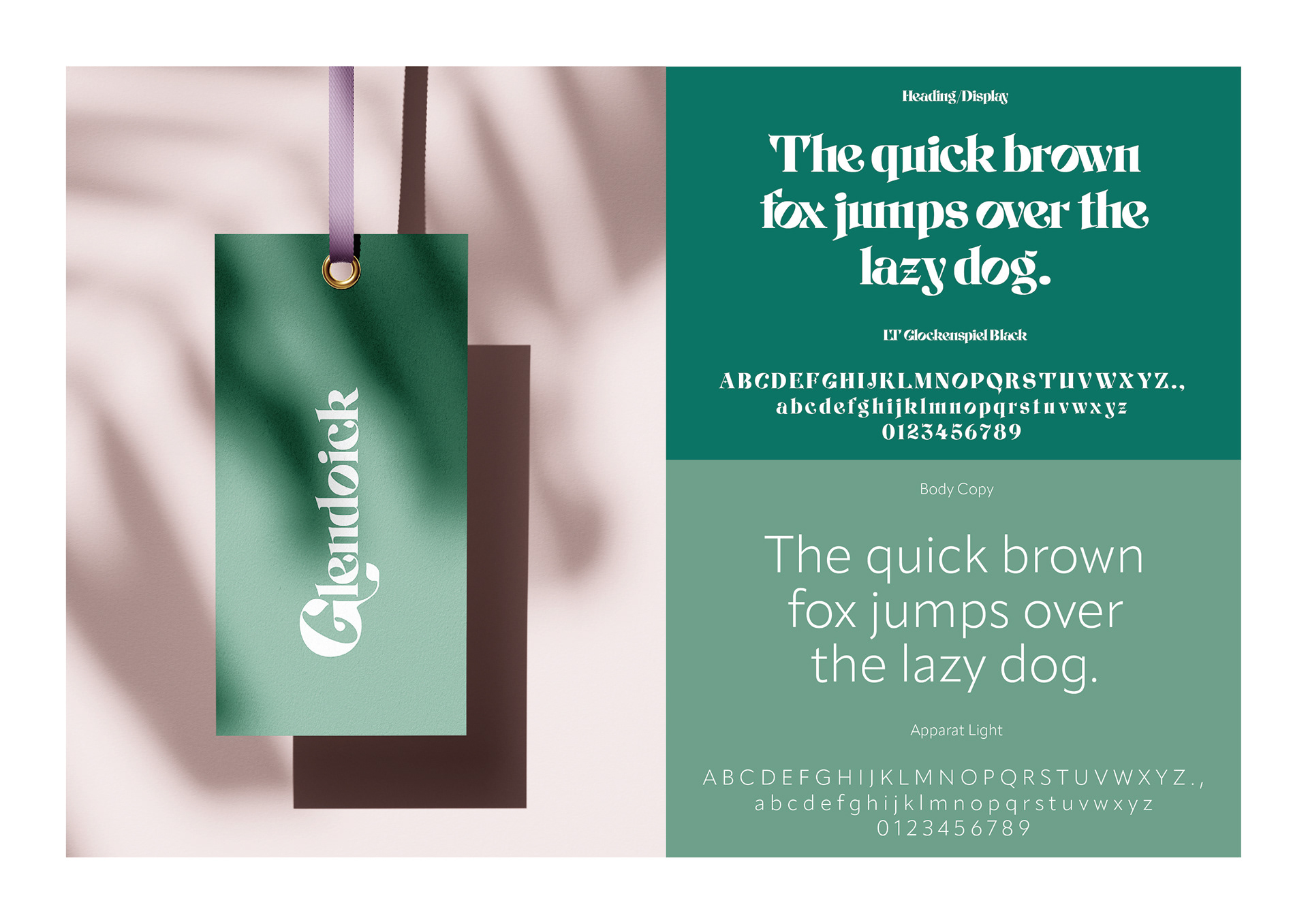
I chose the font to hint back to the 70s era when the centre was founded and redesigned it to give it a more natural look and incorporate leaves into the design.