
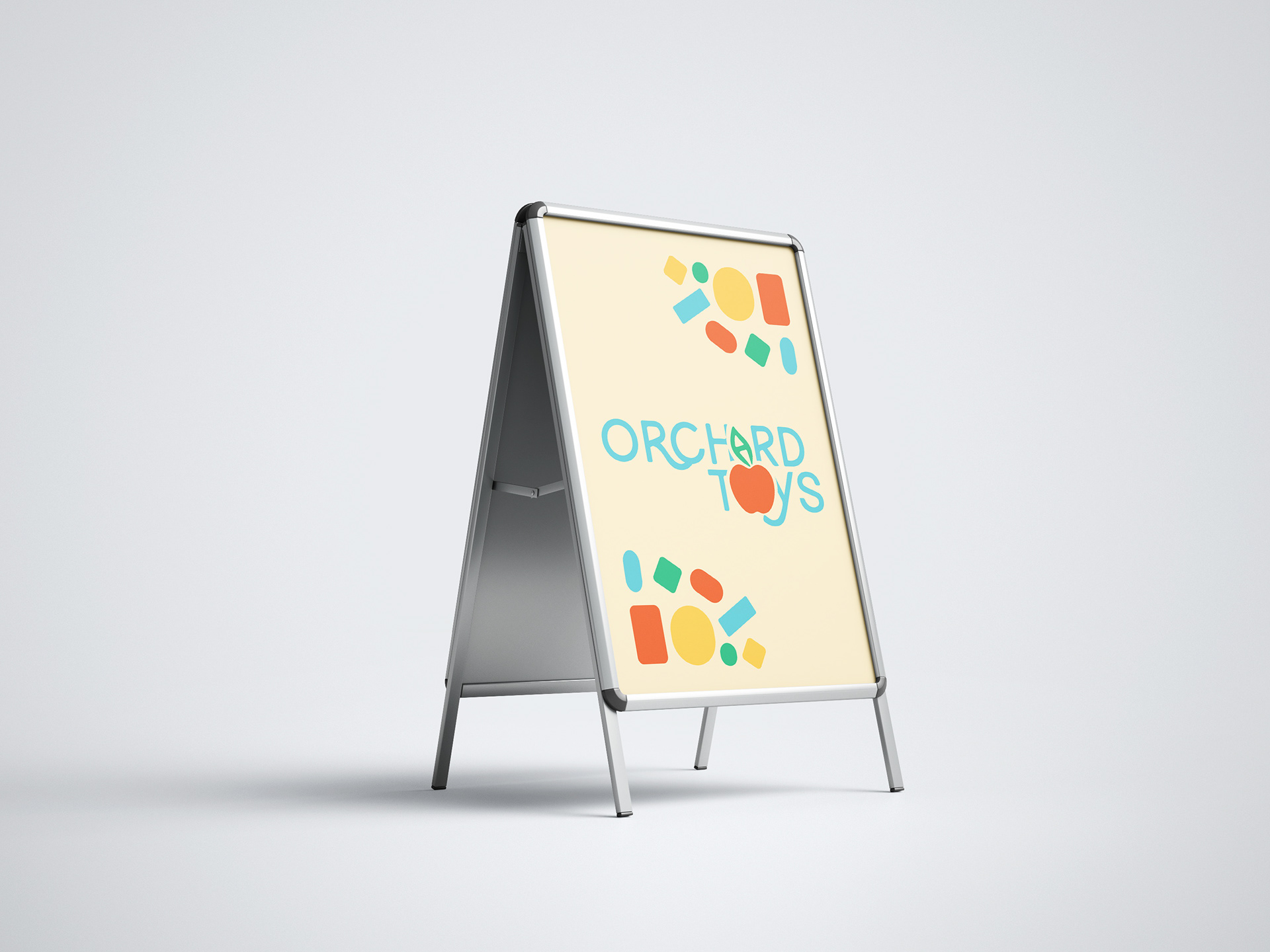
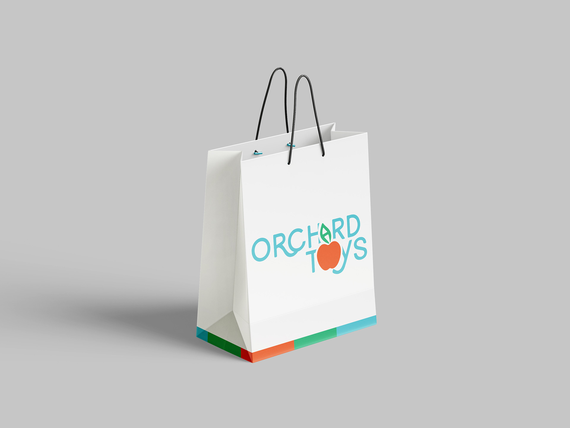
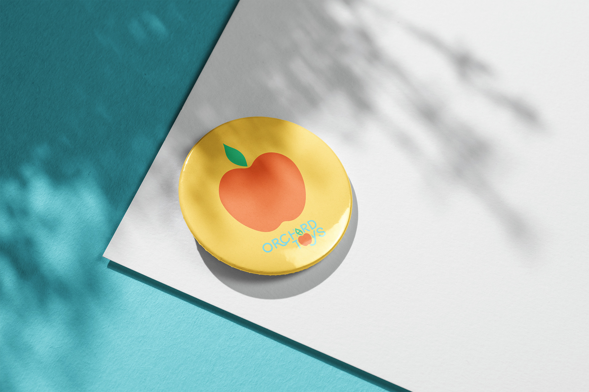
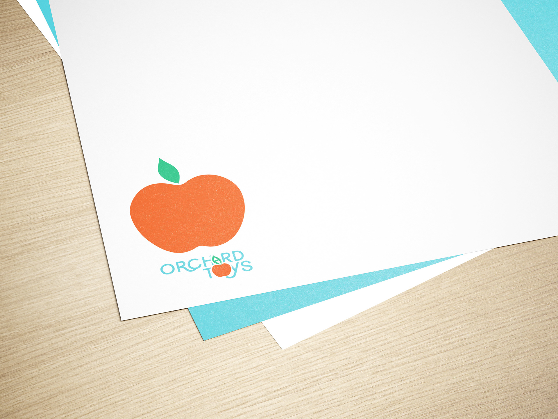

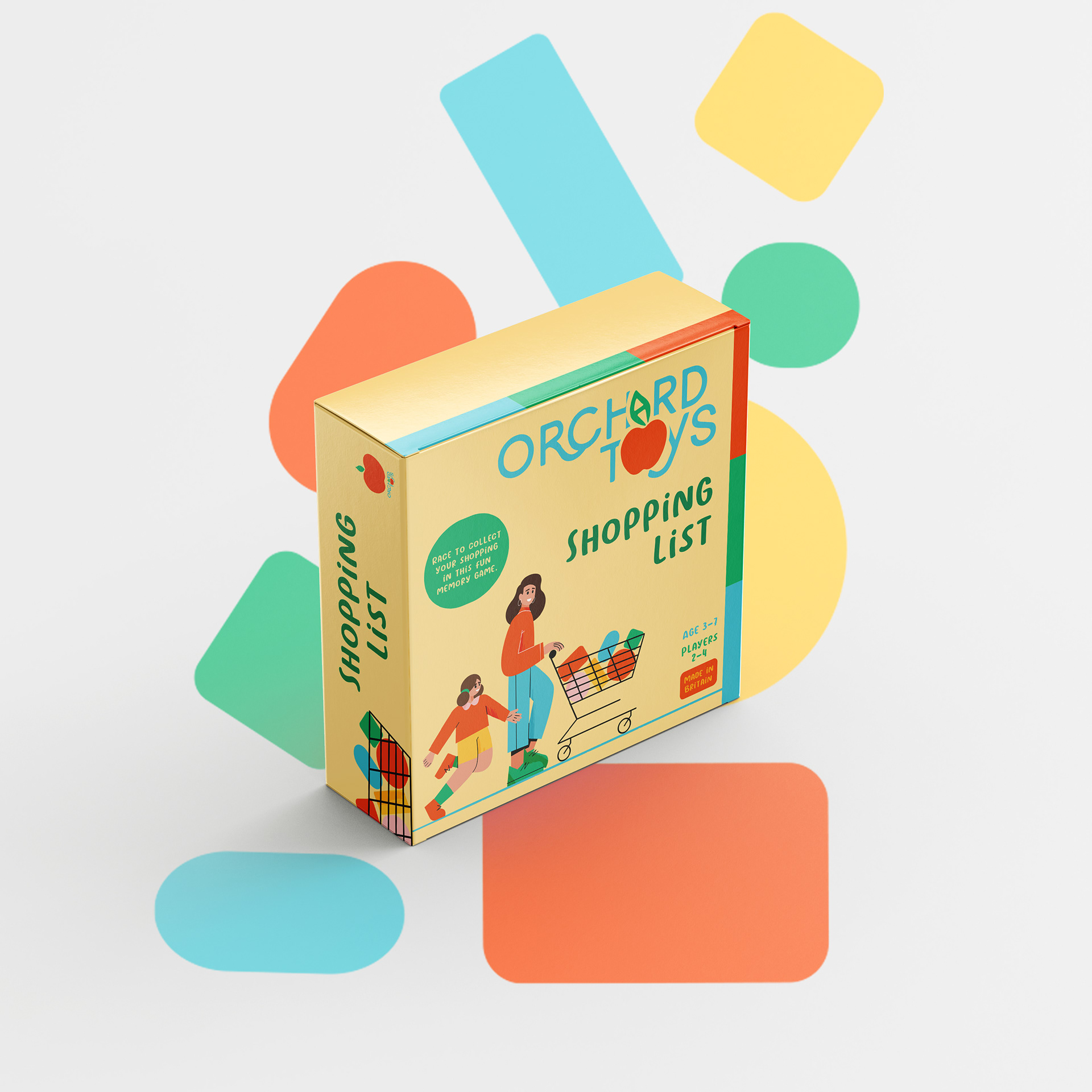
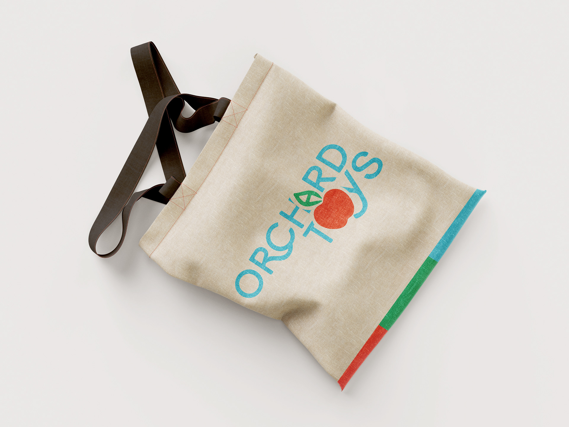
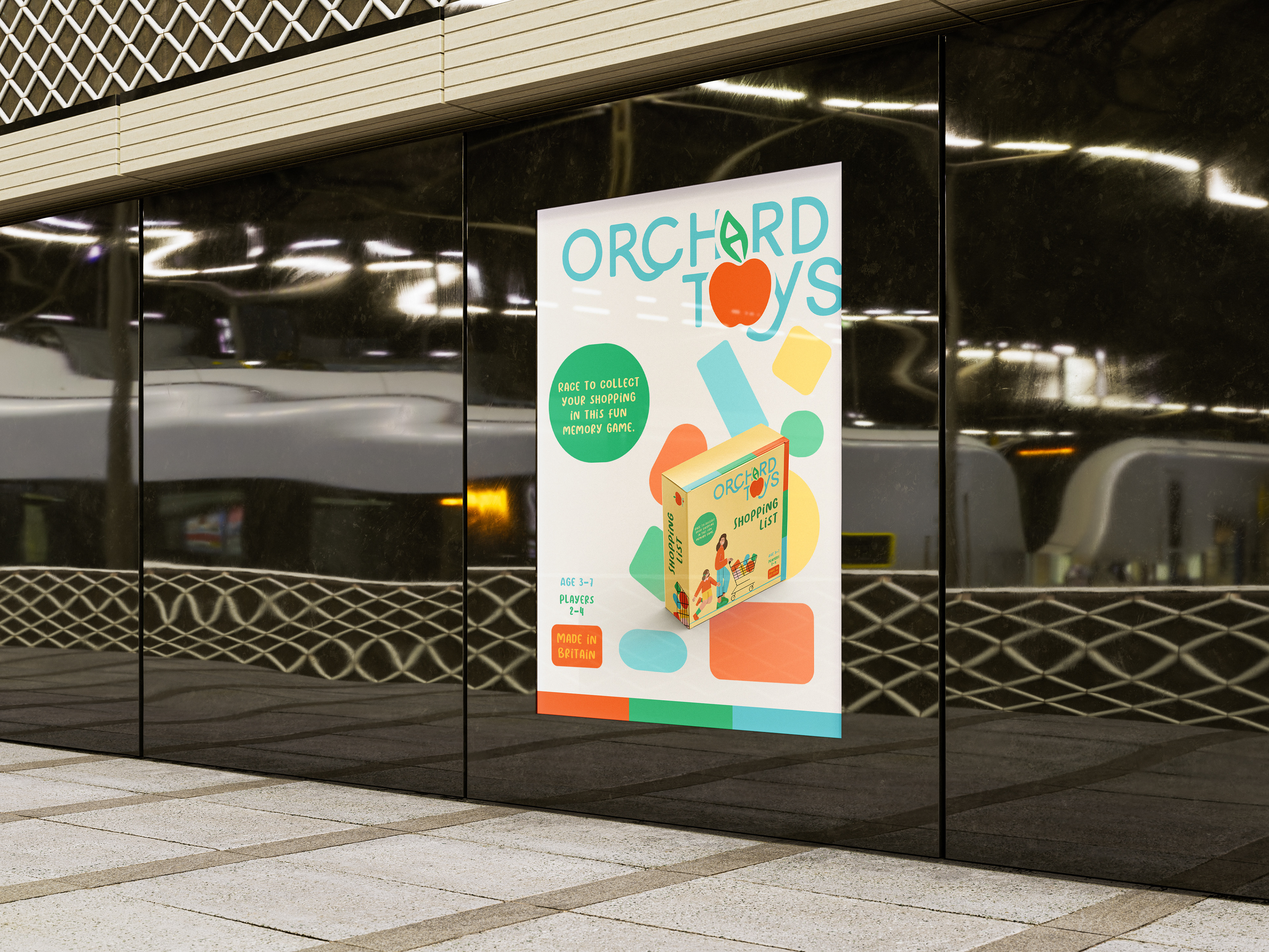
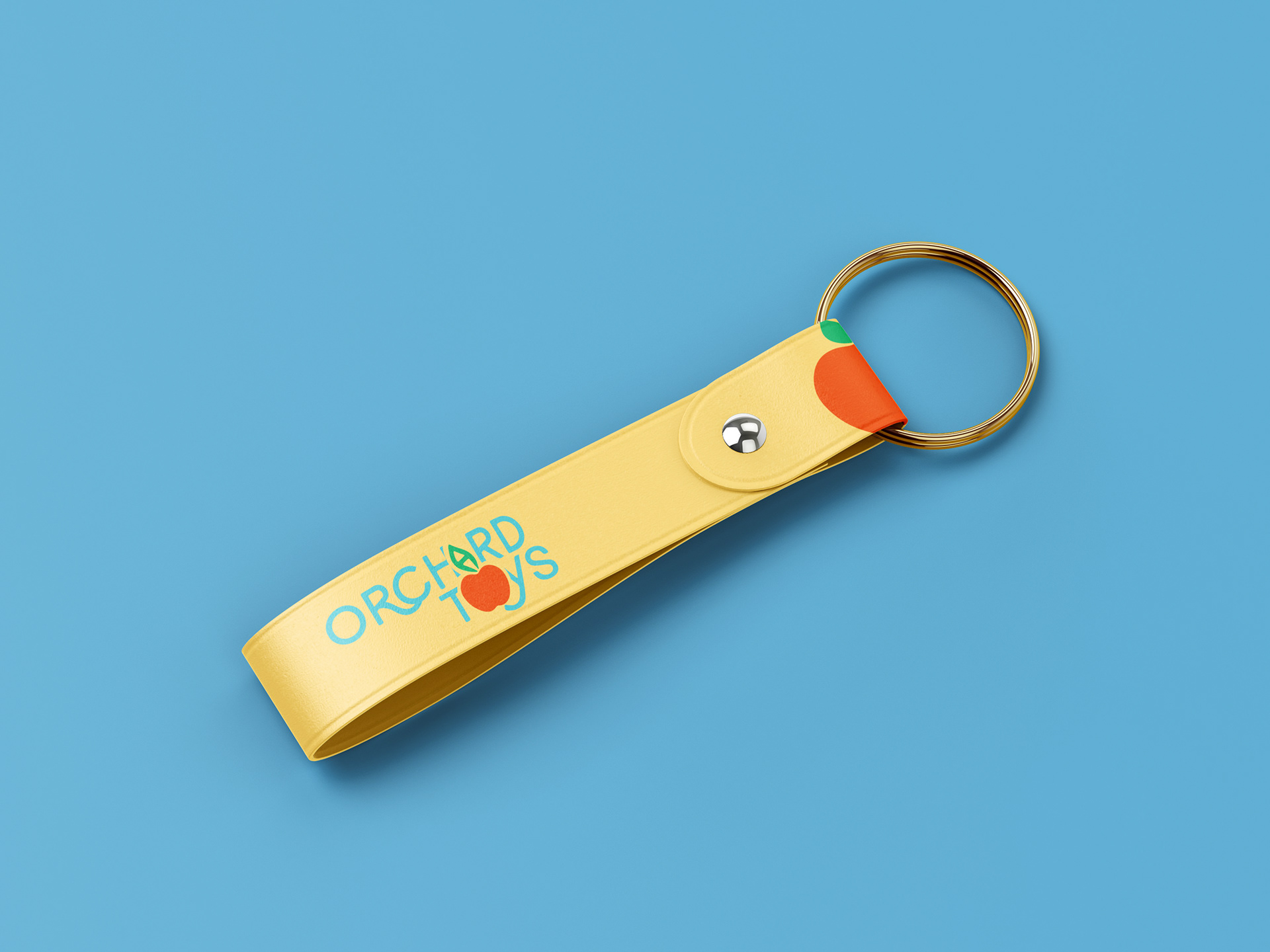
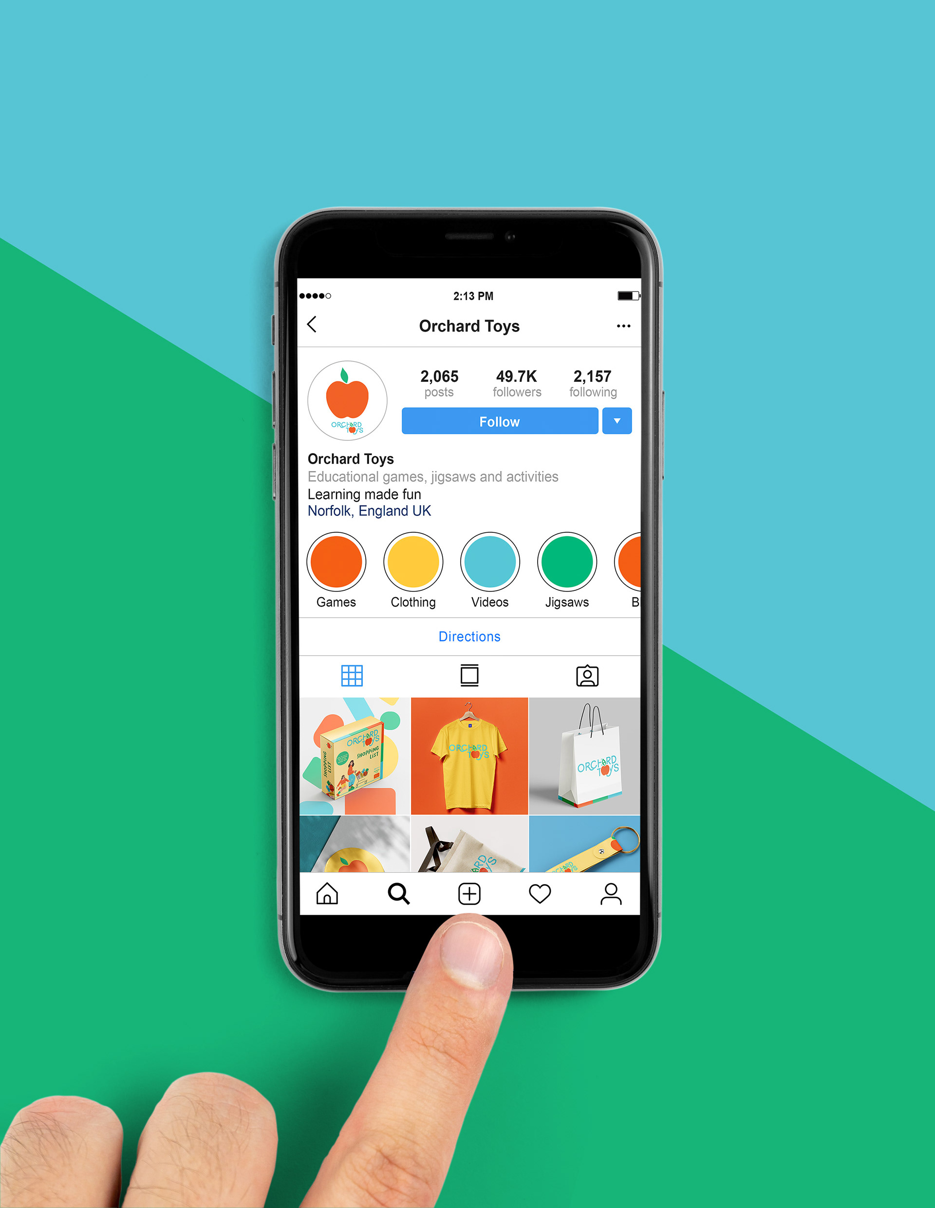
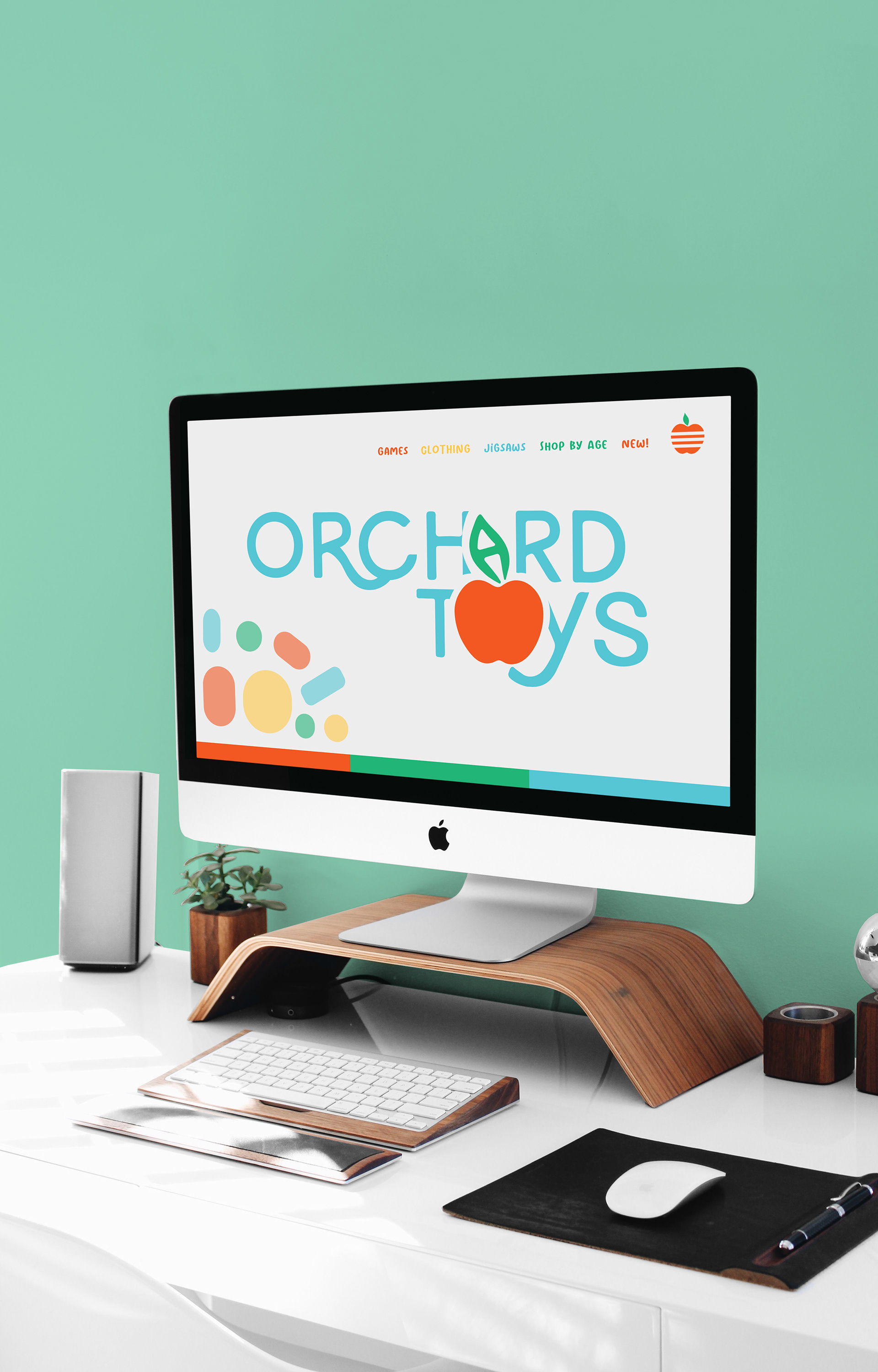
Having two small children, I was inspired to give myself a personal project rebranding a toy company.
I chose the company Orchard Toys as I love their puzzles and games but I felt like their branding could do
with an update to freshen it up.
I chose the company Orchard Toys as I love their puzzles and games but I felt like their branding could do
with an update to freshen it up.
Using bright, cheerful colours and inspired by their original logo which incorporated an apple tree,
I designed the above branding. I feel it does well to appeal to the pre-school/early years audience while
keeping a wholesome feel.
I designed the above branding. I feel it does well to appeal to the pre-school/early years audience while
keeping a wholesome feel.


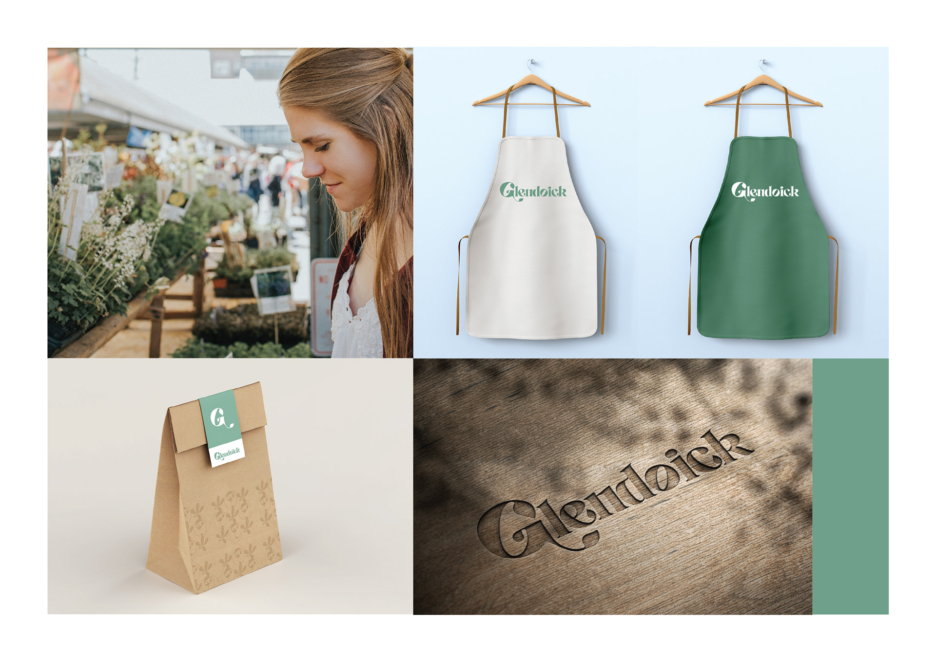
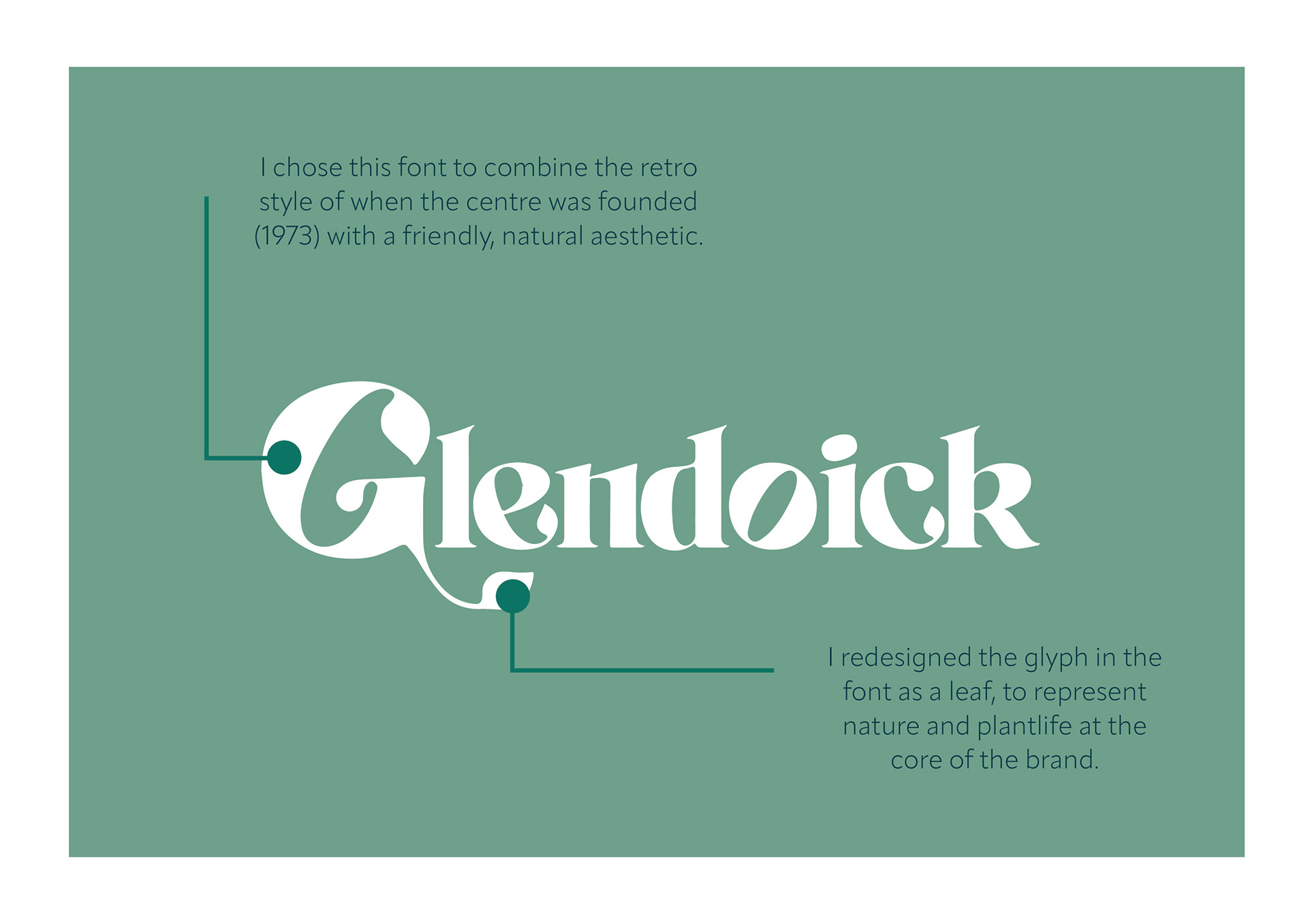


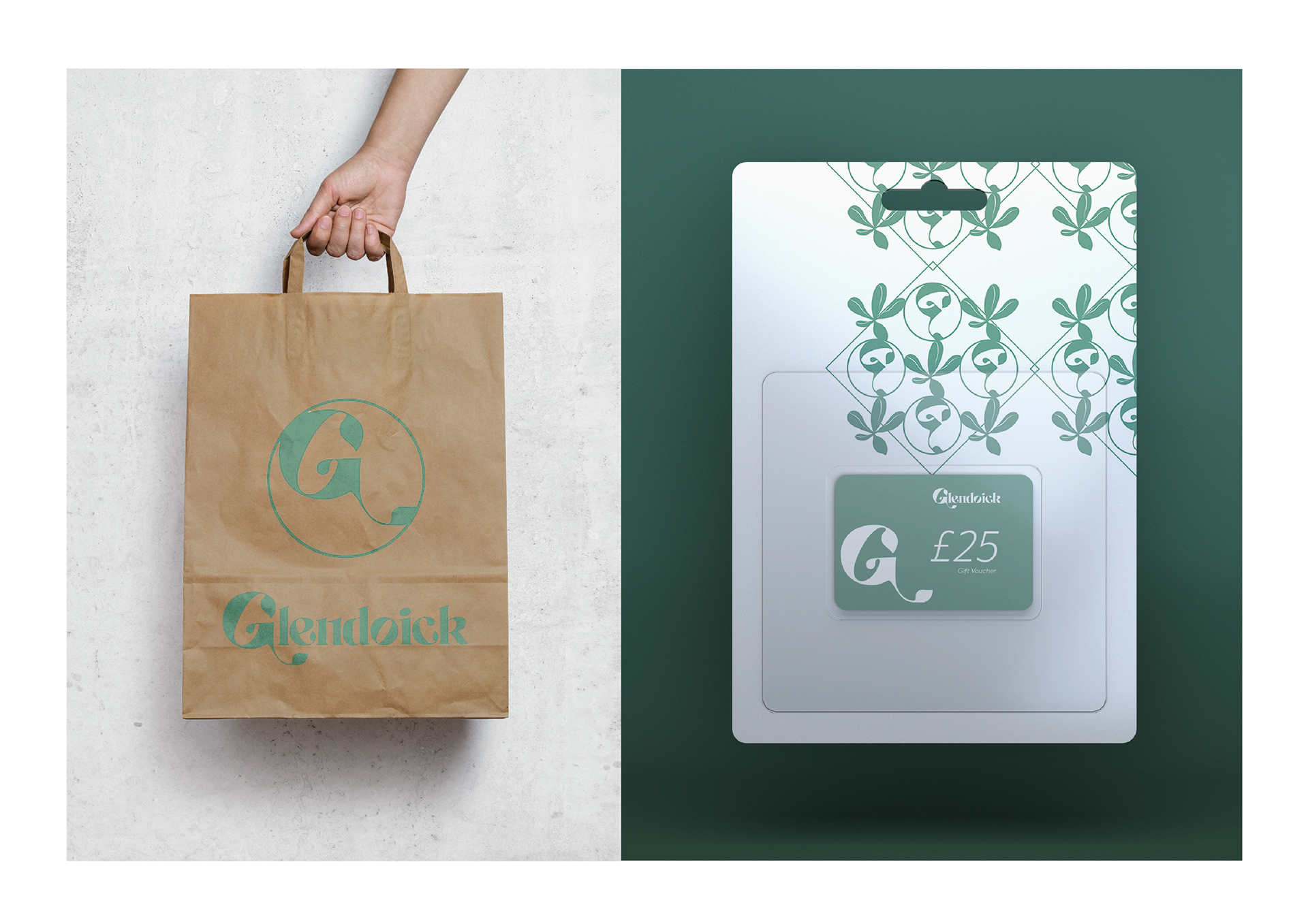
This was a personal project where I chose a local garden centre that's branding I felt needed a refresh.
I chose a garden centre a few miles away from my home called Glendoick. I felt their logo lacked the freshness and natural flow a garden centre should evoke.
I chose a garden centre a few miles away from my home called Glendoick. I felt their logo lacked the freshness and natural flow a garden centre should evoke.
I chose soft greens and a light purple colour to connect with the old style and I was influenced
by the traditional Scottish thistle.
by the traditional Scottish thistle.
I chose the font to hint back to the 70s era when the centre was founded and redesigned it to give it
a more natural look and incorporate leaves into the design.
a more natural look and incorporate leaves into the design.
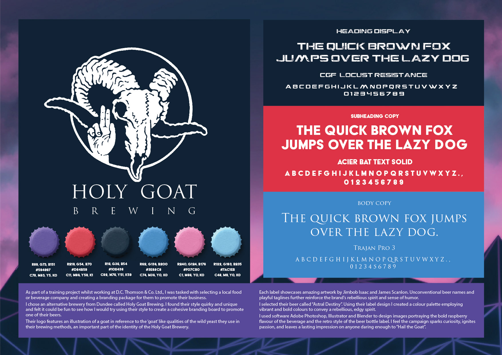
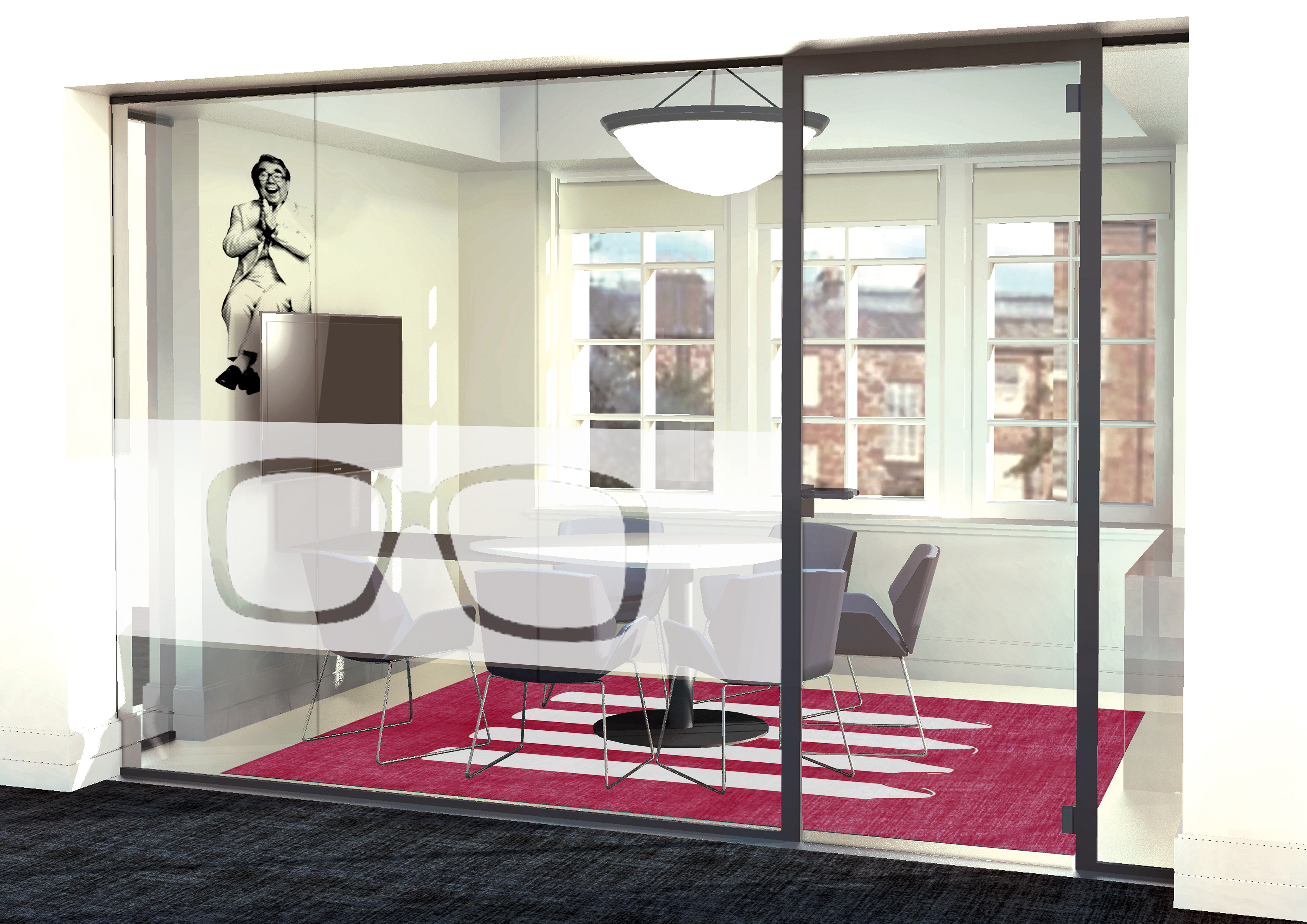

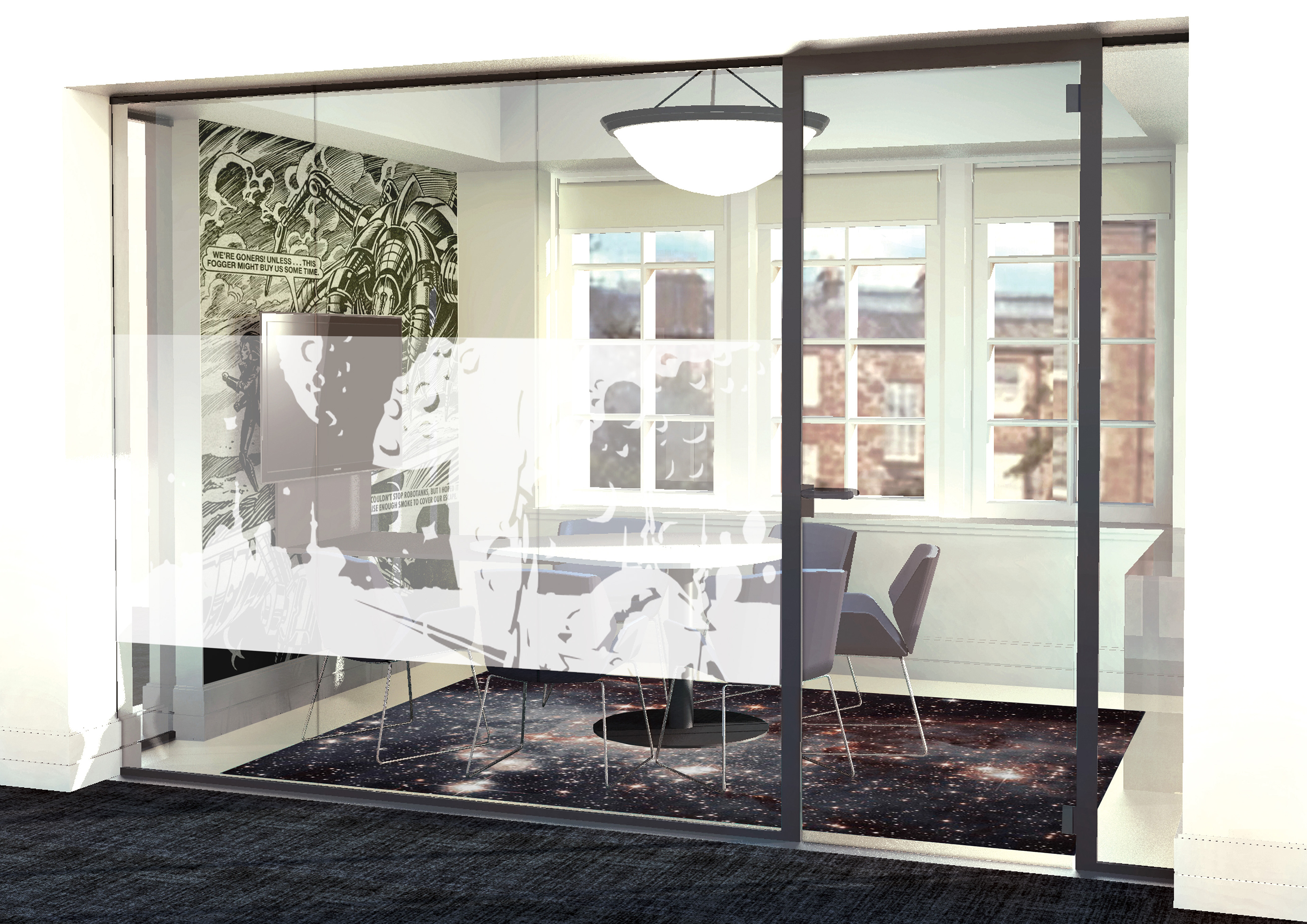
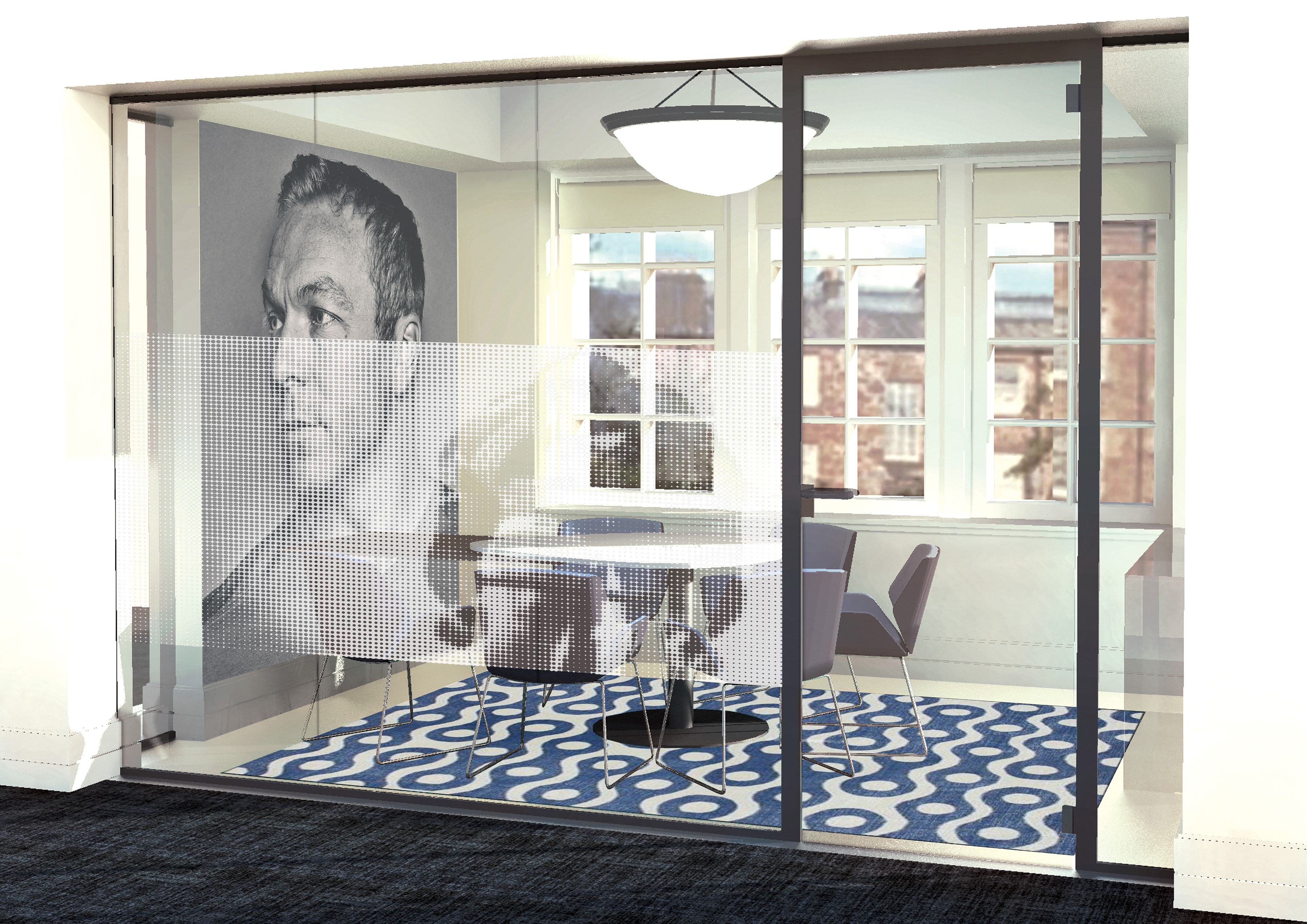


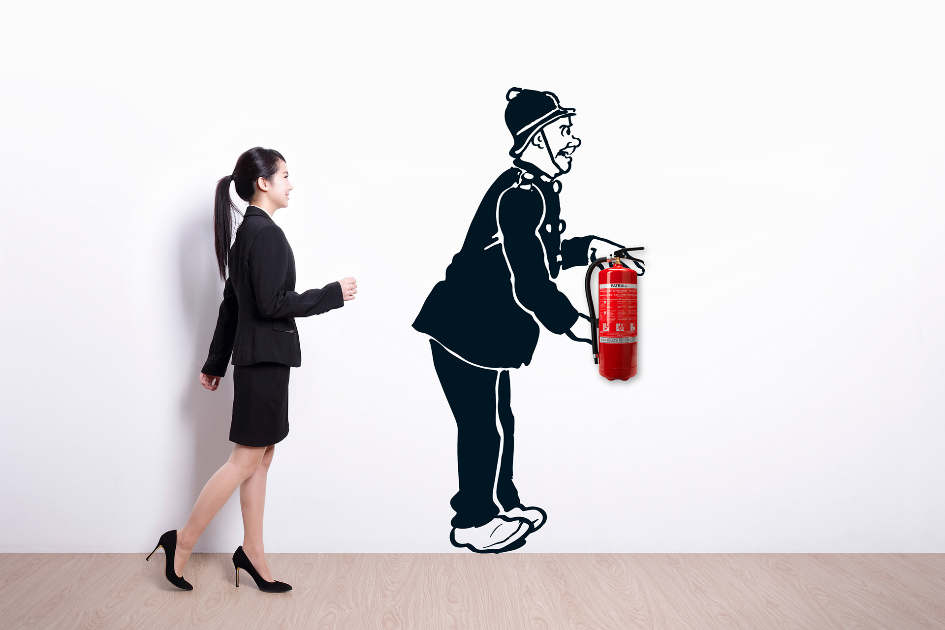
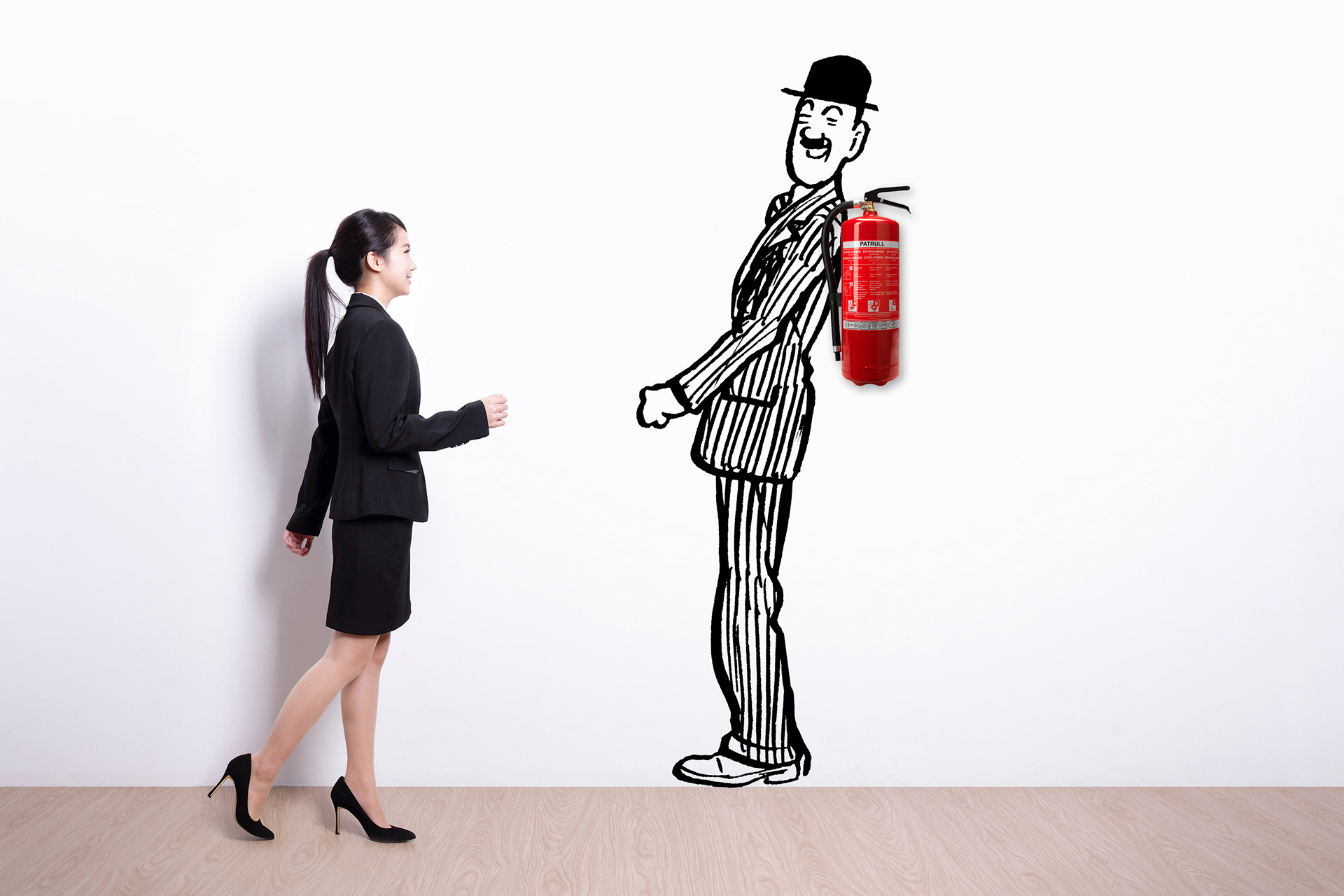
Whilst working at D.C. Thomson & Co. Ltd., we moved into a renovated building. The department
I was part of, was tasked with creating concepts for decorating and theming the building using classic
D.C. Thomson & Co. Ltd. characters and famous Scottish icons. Above are a few of my mock-ups.
I was part of, was tasked with creating concepts for decorating and theming the building using classic
D.C. Thomson & Co. Ltd. characters and famous Scottish icons. Above are a few of my mock-ups.